Article by Felix Jones
Building Altimit.Systems
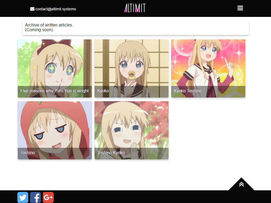
This website has been designed to be responsive to the type of device you're viewing it on.
Here's the website viewed on a desktop browser, an iPad and a Nexus 5x phone;

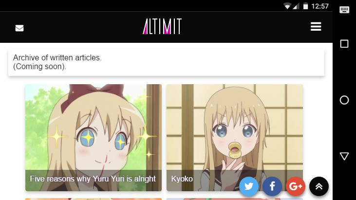

What's particularly cool is that the social media buttons on a mobile phone display in column if they take up too much space, which is likely to happen on the screen of one of the smaller iPhone models.
Even the navigation menu at the top changes if you are on a touch-screen device.
The biggest problem faced with building the website was how the code itself was to be arranged in folders, apparently there isn't much material discussing this on the web.
It's always nice to be able to keep everything organised in a way where making significant layout changes can be done in a single file without breaking everything.